Adam Hausman

Adam Hausman is a co-founder of RSVPify, a leading event management software platform. He lives in Chicago with his wife and very opinionated 16-month-old daughter.
Handling event registration remains one of the most talked-about topics among event planners. Plenty of ink has been spilled on the continuing trend toward late registration from attendees and sponsors alike.
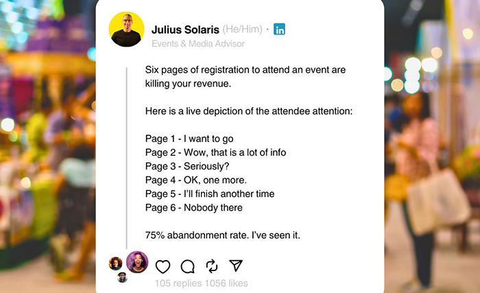
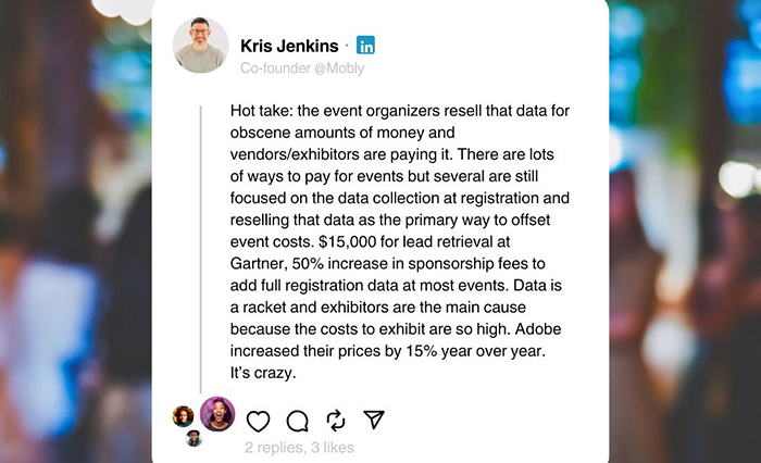
But yet another hot-button topic has emerged – the overly complex registration form. You don’t need to look far among event prof groups to see the strong opinions in the community:


We see plenty of examples of both incredibly simple and incredibly complex registration flows, and requests for tools and features to support both. To help you make your own decision about this issue (or just continue to change your mind like many event profs), we gathered some of the most compelling arguments we’ve seen for each side of the question.
From classrooms to board meetings, it’s no secret that smartphones, social media and more have made it harder to maintain audience attention than ever before. If people have a hard time stopping to watch videos in their social feeds, we can’t expect a multi-page and multi-field registration form to do any better. Quick and simple registration forms can get as many attendees onto email lists for follow-up communications and limit drop-off.
No matter how important your event data may be for both planning or monetization purposes, with registration processes often beginning months in advance of an event, you should have ample time and tools to collect all the info you need. An initial form that gathers contact info and attendance plans allows you to begin building the all-important headcount for venue and vendor selection, while also providing the email list you can use for future data collection.
As attendees become more selective about the events they attend, and more events proliferate as the industry fully recovers from the pandemic era, building excitement and anticipation is essential for driving attendance and making an event successful. Most would agree that filling out forms is not a way to do this. By creating a simplified registration form and instead devoting time to branding and design, or space for promos or teasers about the event (speakers, sessions, surprises), you can differentiate your event and increase attendance. Build the hype first and collect the info later.
Time to look at the other side of the coin. With so many late registrants, late vendor or exhibitor contracts, and delayed vendor and venue decisions thanks to both, frontloading data collection to better curate attendee experiences and optimize your planning can at least reduce some of the logistical headaches. By being smart about what you truly need from attendees, you can create a more detailed registration form that doesn’t drive attendees away and also reduces the number of last-minute details to sift through for beleaguered event staff.
As noted above, the event landscape continues to get ever more crowded, and attendees are looking for something memorable. That’s where a personal touch (unique messaging upon check-in, custom swag bags, detailed schedule and venue maps for each attendee, etc.) can help set an event experience apart. Of course, you can’t provide this level of personalization without info from your attendees, and lead time to create these personal experiences.
For both planners and clients, there are few things worse than having guests suffer physical issues from either food offerings or limitations of a physical space. Not only is it a bad experience for the guests themselves, but these types of problems also tend to reflect badly on everyone involved in planning the event – bad press and word-of-mouth that no event professional wants. Working these questions into the initial registration form can ensure that no guest’s requirements are missed from not seeing future emails or forms in crowded inboxes weeks after registering.
Don’t miss any event-related news: Sign up for our weekly e-newsletter HERE, listen to our latest podcast HERE and engage with us on LinkedIn!
